UX Design · Charity Connect
The gap between wanting to help and knowing how.
60,000 registered charities in Australia. Thousands of people who want to give. And a disconnect so wide that 39% of Australians can't name a single charity within 100km of their home. Charity Connect was designed to close that gap — from both sides.
Breakfast on the Floor
01.
The situation.
There are over 60,000 registered charities in Australia. Around 30,000 of them are small, community-level organisations earning less than $250,000 a year — run almost entirely by volunteers, with no budget for marketing, no visibility, and no easy way to reach the people right next door who would help if they only knew how to find them.
On the other side of that gap: communities full of people who want to give. But giving is confusing. Where does money actually go? Who's legit? What do they actually need right now? The intention is there. The pathway isn't.
This wasn't a problem of generosity. It was a problem of infrastructure. The people and the charities were already there. They just had no way to find each other.
02.
The research.
Two surveys were created — one targeting the general adult population, one targeting school-aged children. 26 responses. The data confirmed the hypothesis, but with some surprises.
39%
of participants could not name at least 5 charities within 100km of their home.
78%
had concerns about how their money and donated items are actually distributed.
88%
of "extra small" charities operate with no paid staff — solely reliant on community volunteers.
The trust barrier was significant. People weren't indifferent — they were uncertain. The design had to address discovery and credibility simultaneously.
03.
The thinking.
The brief wrote itself from the data: build something that works for both sides of the gap. Charities need a way to surface their needs locally. Community members need a low-barrier, trust-building way to respond.
Three design decisions shaped everything:
1. Role-based onboarding. The app serves community members, educators, charity employees, and volunteers differently. Starting with role selection meant every user got an experience relevant to them from the first screen.
2. Location-first discovery. The 39% stat drove a core design decision — a radius-based feed that only surfaces charities near you. Local = credible. Local = actionable.
3. Multiple giving modes. Not everyone can give money. The app supports financial donations, goods and services, and volunteering — lowering the barrier to entry for every kind of supporter.
The 78% who worried about where their money went told me the app needed to build trust before asking for anything. Verification badges, local charities they could recognise, and transparency in the giving flow.
04. The work
Onboarding flow
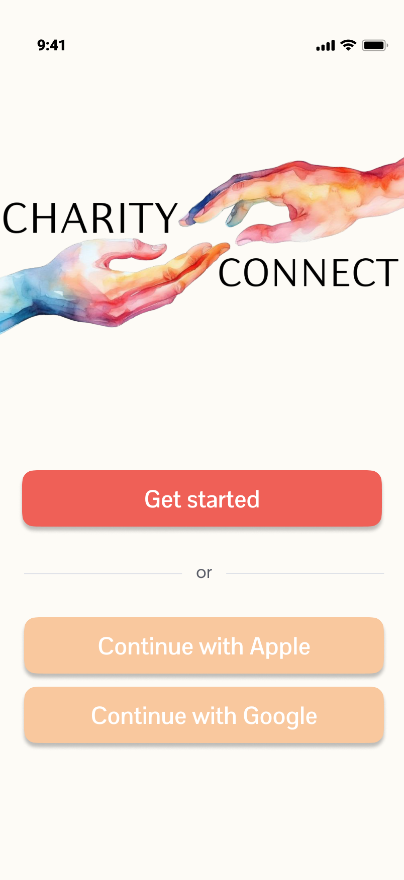 Splash
→
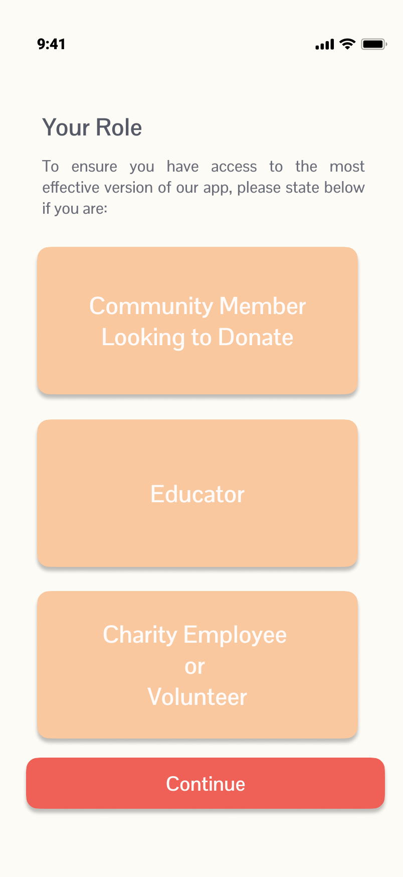 Role selection
→
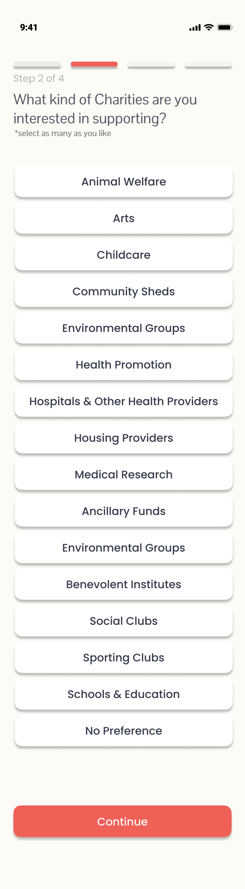 Preferences
→
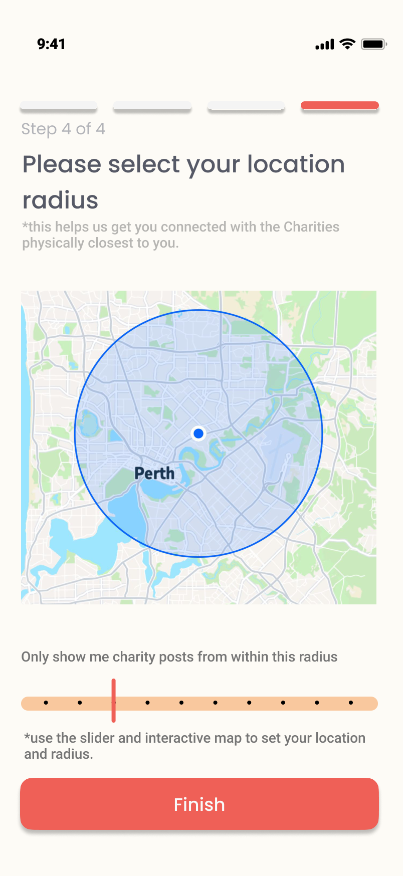 Location radius
→
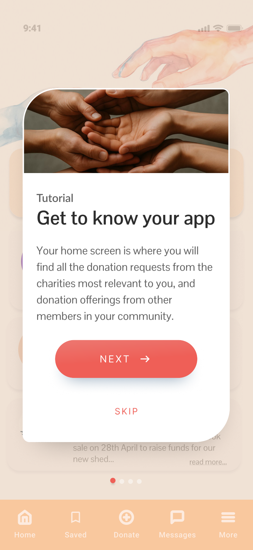 Tutorial
Four-step onboarding builds a personalised experience before the user sees a single charity post. Role, preferences, support type, location radius — each step narrows the feed to what's genuinely relevant.
Home feed & post detail
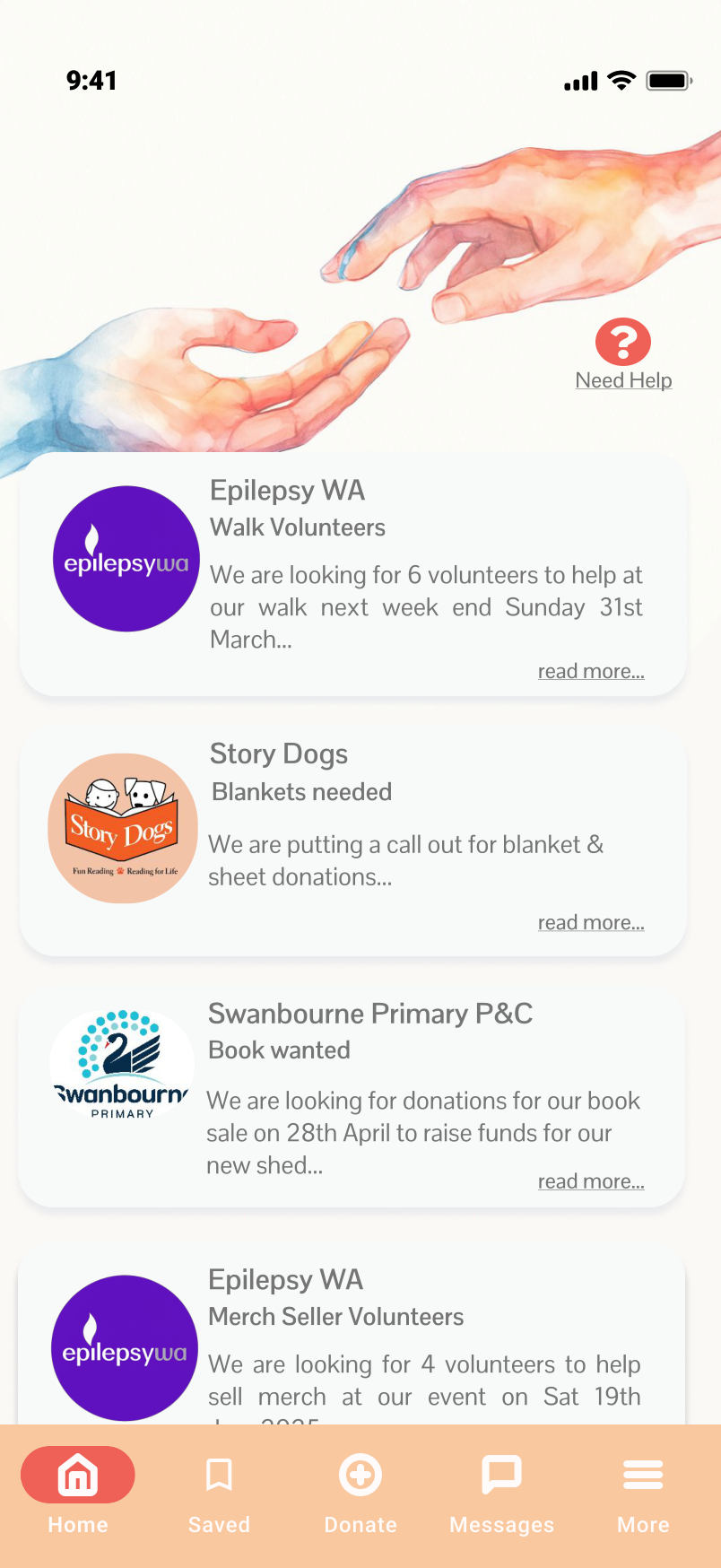 Personalised feed
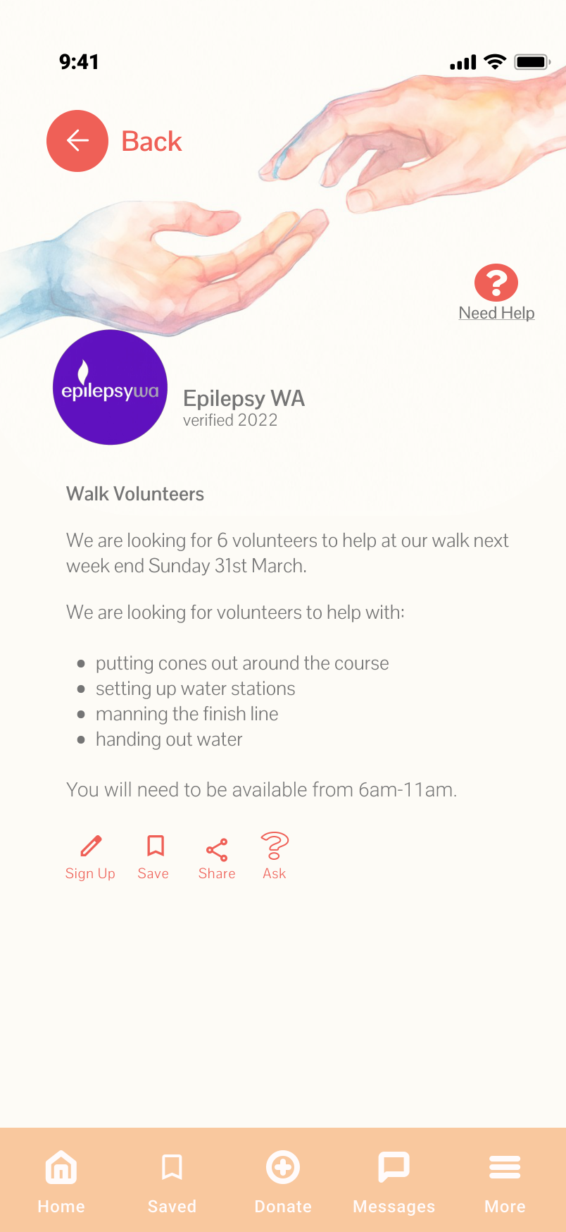 Post detail & actions
The feed surfaces charity requests from verified local organisations — filtered by proximity and the user's stated preferences. Each post carries four action options: Sign Up, Save, Share, Ask.
Financial donation flow
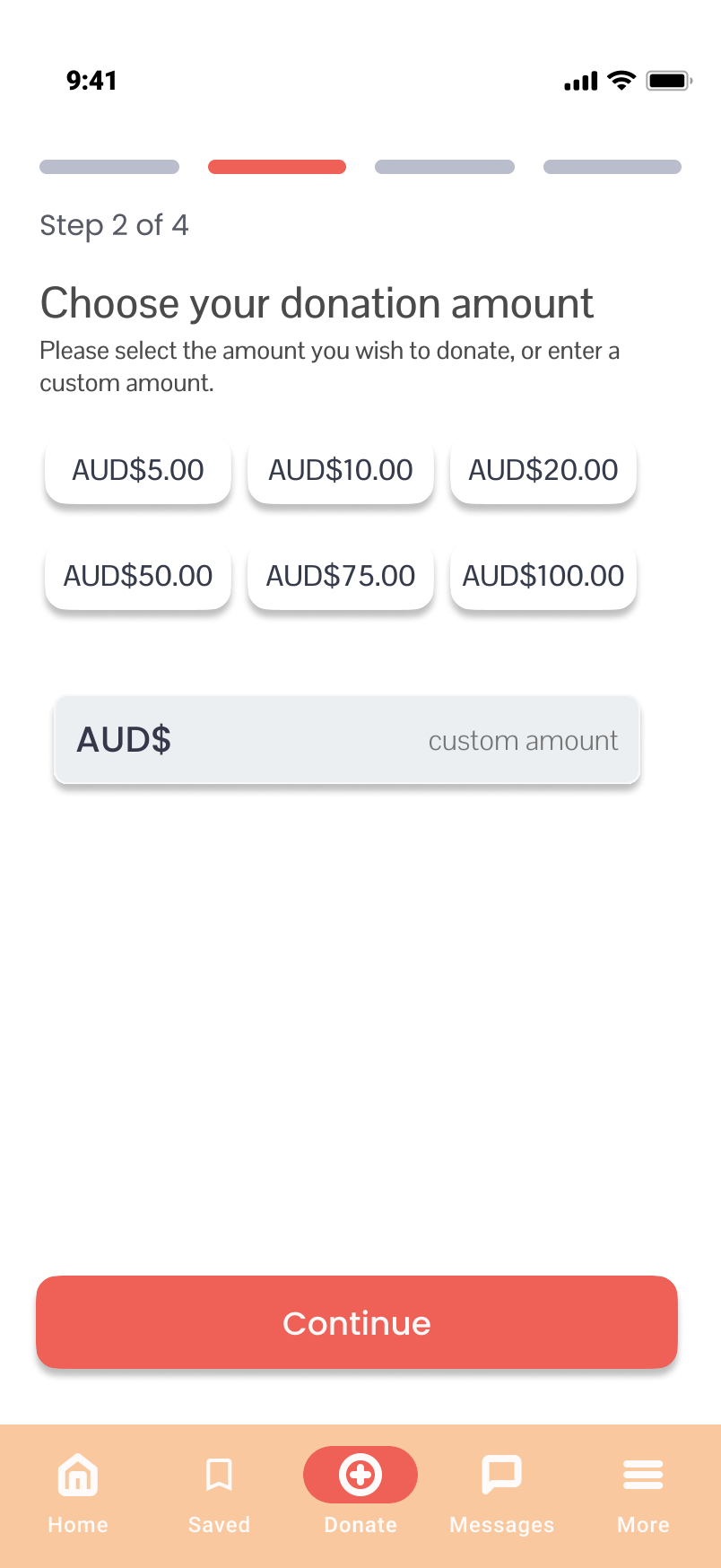 Choose amount
→
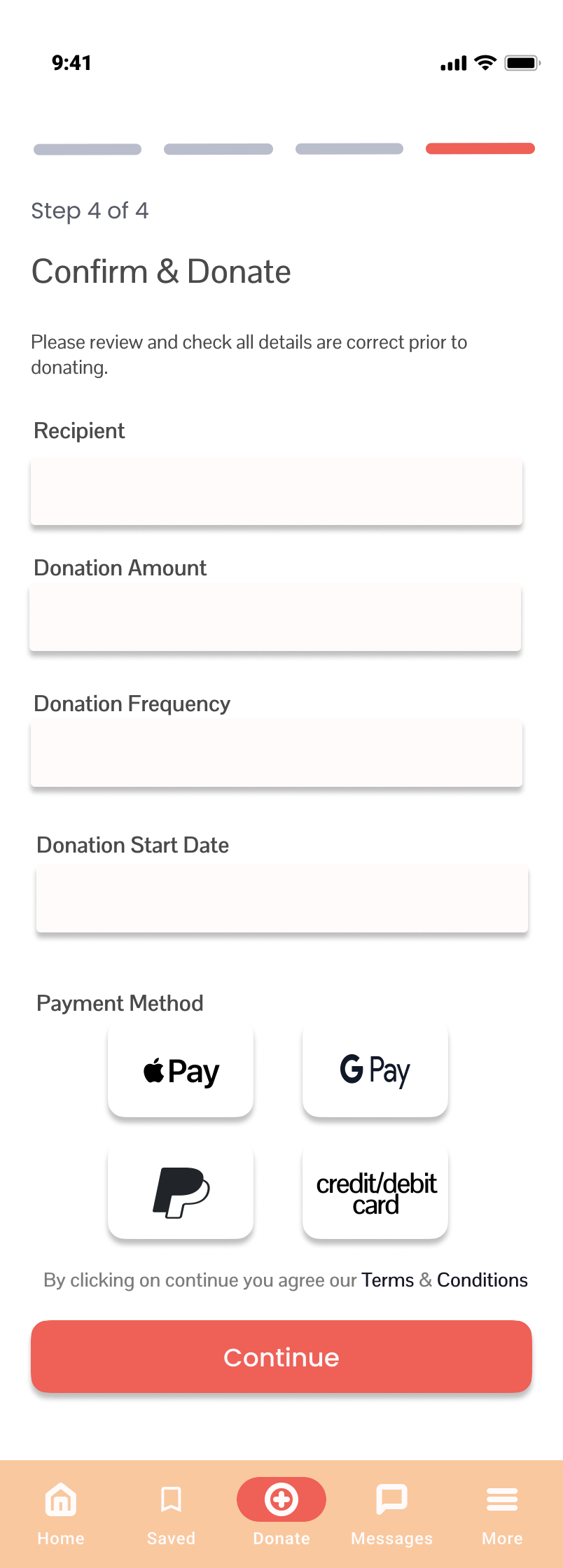 Confirm & pay
→
 Donation confirmed
The giving flow is designed to be frictionless — preset amounts, Apple Pay / Google Pay / PayPal / card, and a confirmation screen that reinforces the emotional payoff without overselling it.
05. What changed.
01.
A two-sided platform that gave both charities and community members a meaningful way to connect — on their own terms.
02.
Location-first discovery that made small, local charities as visible as national organisations for the first time.
03.
Three giving modes that removed the money barrier — so anyone who wanted to contribute could, in a way that suited them.
From the floor sitter
Good intentions don't help anyone if there's no bridge to act on them.
The research kept returning to the same thing: people weren't ungenerous. They were uncertain. They didn't know who needed what, whether their donation would land well, or how to find something local enough to feel real. The app didn't create generosity. It gave it somewhere to go.
What I found most interesting about this project was the dual-sided nature of the problem. It wasn't enough to design for one user — the whole system only works if both sides of the connection feel served. Every design decision had to hold up from both perspectives simultaneously. That's the kind of problem I find most interesting to sit with.
You don't need to know where to start.
That's literally the first thing we figure out together. Bring the idea, the half-idea, or just the feeling that there's something there. That's enough.
Book a floor session →
Back to the work →
Breakfast on the Floor
Kerry Mahoney · The Floor Sitter
breakfastonthefloor.com.au